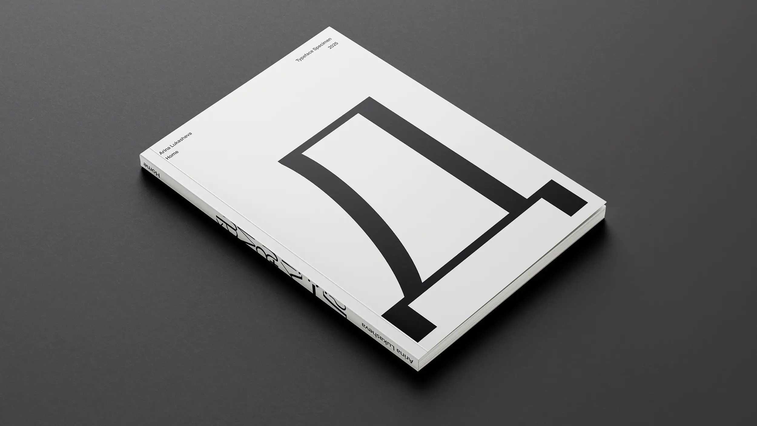
Home

Intro
A display Cyrillic typeface built out of the experience of immigration. Home supports nine writing systems — Russian, Ukrainian, Uzbek, Kazakh, Serbian, Moldavian, Mongolian, Tajik and Montenegrin — and is released under the Open Font License. The project pairs the typeface with a printed specimen and a poster series in which the word for "home" is set in different Cyrillic languages over photographs of post-Soviet residential architecture. Type design here is treated as a way to hold cultural memory in form — to give the idea of home a shape when its physical version is no longer accessible.The typeface supports nine Cyrillic writing systems: Russian, Ukrainian, Uzbek, Kazakh, Serbian, Moldavian, Mongolian, Tajik, and Montenegrin.
Deliverables:
Type design
Typeface Specimen
Postcard
Poster
Year
/
2025
The Problem
For a generation of young creatives who left post-Soviet countries in the 2010s and 2020s, the idea of home stopped being a stable address and became something closer to a memory under reconstruction. The visual culture they grew up with — Soviet and post-Soviet architecture, film posters, signage, iconography — is rich, but contemporary type design rarely speaks to it. Most display typefaces with Cyrillic support are Latin-first, with Cyrillic added as an afterthought, or rooted in a single national tradition. Neither serves a community that is multilingual, displaced, and looking for a visual language that belongs to them rather than to a single state. Home was built to address that gap: a Cyrillic display typeface designed from inside the experience of leaving, rather than from a neutral typographic distance.
Positioning
Home sits between industrial structure and humanist detail — the same tension that runs through the post-Soviet cityscape itself. The skeleton borrows from constructivism and brutalist architecture: strict verticals, near-square proportions, confident geometry. The details come from Old Russian iconography and Soviet film posters of the 1960s and 70s — soft junctions, selective serifs, a calligraphic memory in the joints. The result is a display face that reads as monumental at headline size and personal up close. It is not a neutral workhorse. It is a voice — designed for posters, editorial covers, exhibition graphics, independent publications, and any context where Cyrillic needs to feel both contemporary and rooted in a place.
Visual Language
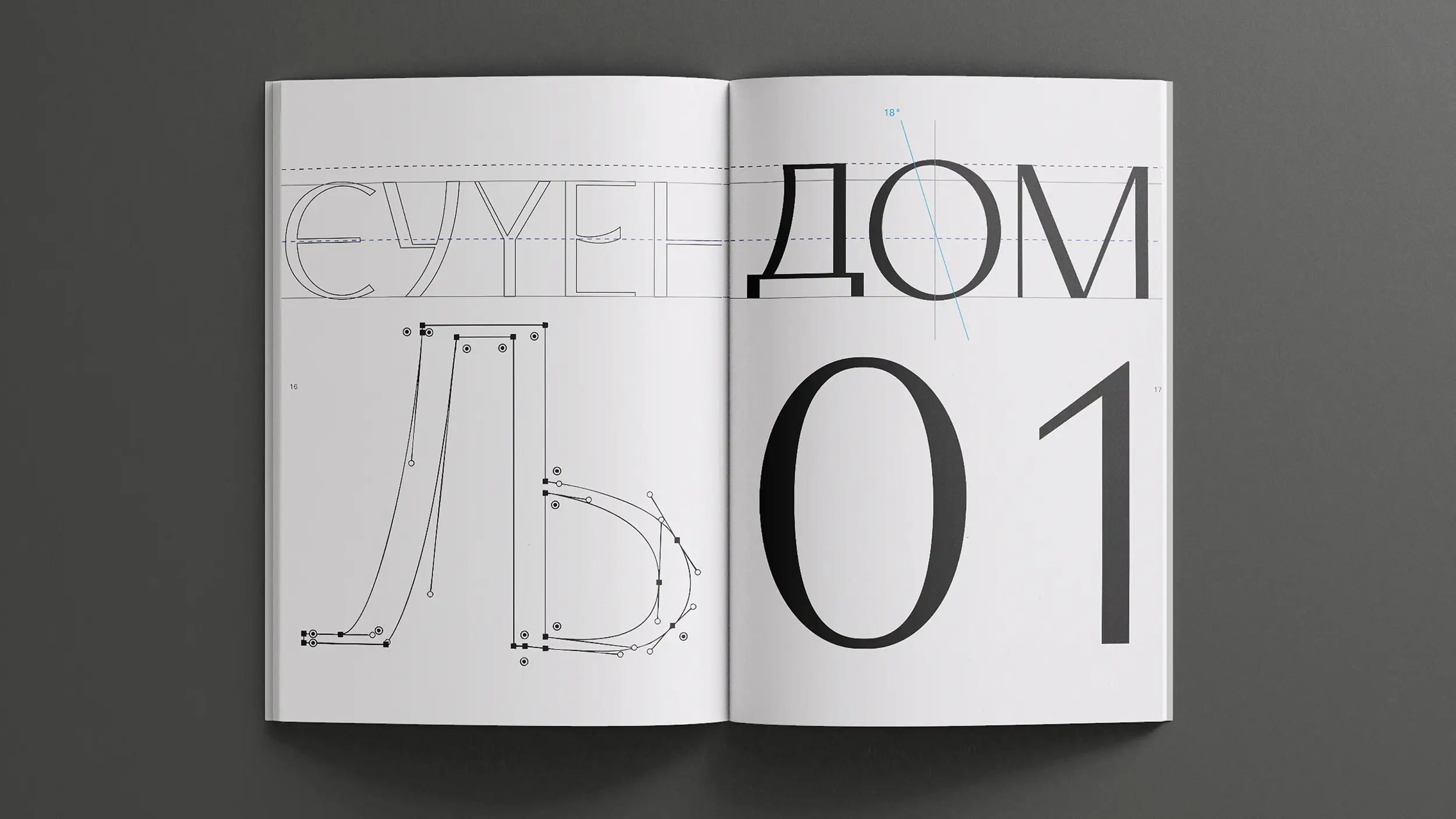
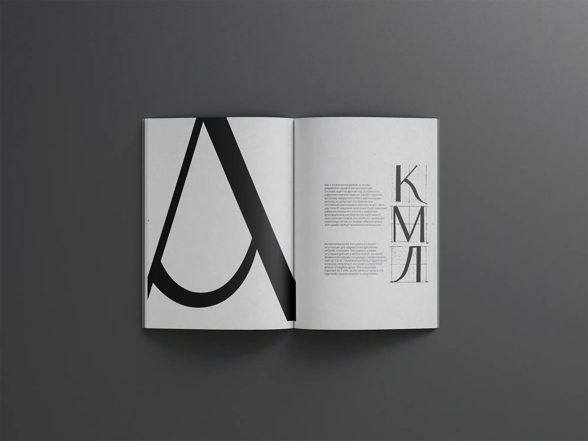
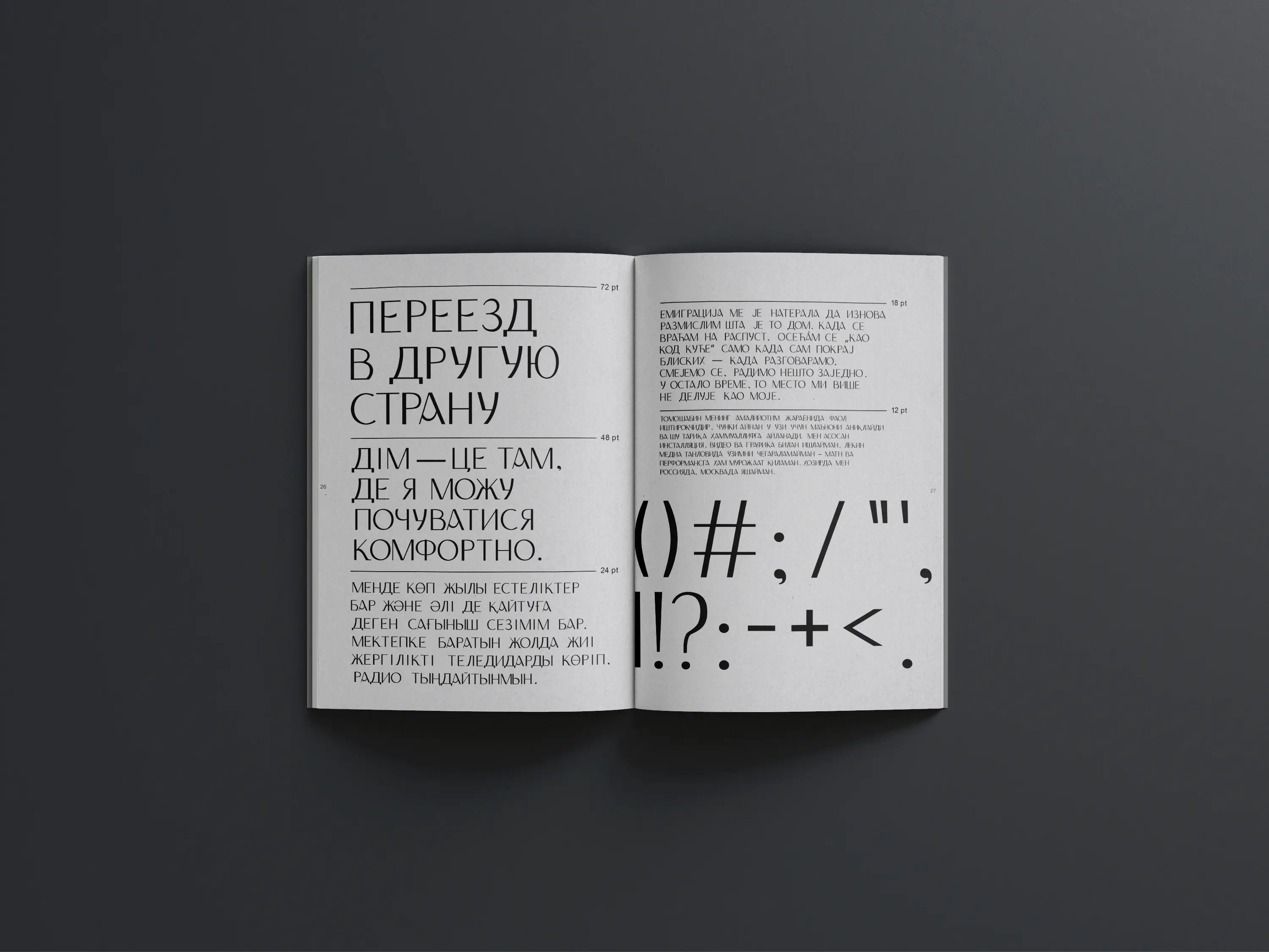
The typeface is built on a modular square grid with a vertical rhythm, with deliberate optical deviations for complex glyphs like У and Ю. Contrast sits at roughly 70 percent — high enough to give the face presence, restrained enough to keep it readable at display sizes. The axis is strictly vertical across the alphabet, with one deliberate exception: the counter of О is angled at 18°, introducing a single moment of movement that travels through any word containing it. Selective serifs on К, Л and Ж break the rigidity of the grid without overwhelming it with ornament. Wide proportions preserve generous negative space — something Cyrillic, with its denser glyph variety, needs more than Latin. Eight ligatures (кл, кж, ка, км, жл, жд, ыл, мл) and fully manual kerning resolve the spacing problems specific to Cyrillic, where letter widths vary far more than in Latin and automatic kerning consistently falls short.

Audience
Young creative professionals from post-Soviet countries — designers, art directors, editors, independent publishers — working between their country of origin and a second base abroad. According to data from ZOiS and CASE, this group makes up the largest share of recent migration from the region, and yet their visual culture remains under-served by contemporary type tools. Home is licensed under OFL precisely for this audience: it can be used freely in self-published magazines, exhibition graphics, posters, and small-studio identities where licensing budgets are limited but visual standards are not. Extending the typeface beyond Russian — to Ukrainian, Uzbek, Kazakh, Mongolian, Tajik, Serbian, Moldavian and Montenegrin — was a deliberate choice to move away from a Russia-centric reading of "post-Soviet" and let the typeface belong to a wider community.
The System
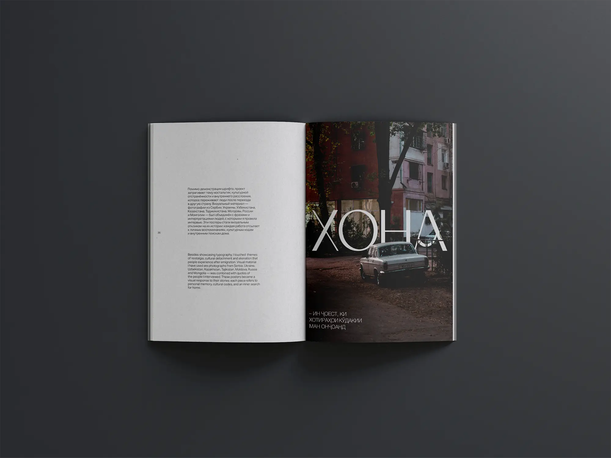
The project was built across three connected outputs that reinforce each other. The typeface itself was developed through hand-drawing, vectorisation in Adobe Illustrator, and final production in Glyphs. Foundational modules (Н, О, Д, Г, И, К, С, У) were drawn first to establish proportion and character, then extended across the full character set with iterative print testing. The printed specimen integrates research, prototypes and an essay into a single experimental publication, printed on FSC-certified G. F Smith Colorplan with a calculated carbon footprint of around 960 g CO₂ per copy. The poster series translates interview material from creatives across Eastern Europe into image. The word for home — Дом, Дім, Хона — is set over documentary photographs of residential buildings from each interviewee's country, paired with a quote from the conversation. The posters are where the typeface meets the people it was made for.
—
